
*Ed.’s Note: click images to view larger sizes.
I believe I’ve written this before somewhere, perhaps many times and in many places, but when it comes to the book as object, as a work of art, UK-based comics and illustrations publisher Nobrow is the standard bearer. Their books and magazines, ranging from small and concertina-folded to enormous and hardbound, are always beautifully designed and elegantly produced. It is likely because of this fact that many of the comics world’s most exciting new talents are finding their way to Nobrow. In fact, next to their reputation for production values, finding and debuting idiosyncratic new talents appears to be Nobrow’s bread and butter. With that in mind, here is an overview of three recent debuts.
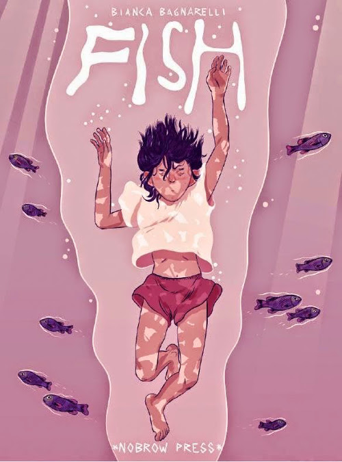
Fish, by Bianca Bagnarelli. Nobrow Press, October 2014. 24 pages, $11.00, paper.
As a part of Nobrow’s 17×23 Series, Fish fits within a very specific zine-style format: twenty-four pages, seventeen by twenty-three centimeters. I really love the concept of this series, which provides further evidence of Nobrow’s mission to cultivate the work of young graphic artists (the intention being to offer “a manageable and economic format … as a springboard for more ambitious projects”). I’ve read a few others from the 17×23 Series, and I’ve never been let down—Nobrow really does know how to pick ‘em—but something about Bagnarelli’s work resonates larger, by which I mean, Fish promises Bianca Bagnarelli is going to utterly slay the comics world some day with her “more ambitious project(s).”
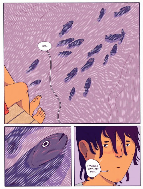
Fish tells the story of twelve-year-old Milo, a young boy living in the shadow of his parents’ death on the French Rivera. Awash in a multi-hued pink-purple summer, Bagnarelli gives ample space to Milo’s quiet grief, adding a formal sensitivity to the work through her gorgeously fluid line work and masterful use of color. With expansive, often textless panels, Milo roams about, mostly silent, having awkward interchanges with his cousins and witnessing various iterations of death. The narrative culminates with the news of a local girl found drowned on the beach. What’s impressive here is that Bagnarelli, even in the face of such enormous themes—mortality, adolescence, loss—never fails to be nuanced and incisive, allowing a wide breadth of illustrated emotions to stand on the strength of her illustrations. The story is complex and powerful—and sharpened by the delicacy with which Bagnarelli meets every page. Fish is a great introduction to one of the most promising talents on the scene.
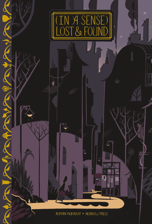
(In a Sense) Lost & Found, by Roman Muradov. Nobrow Press, September 2014. 56 pages. $19.95, hardcover.
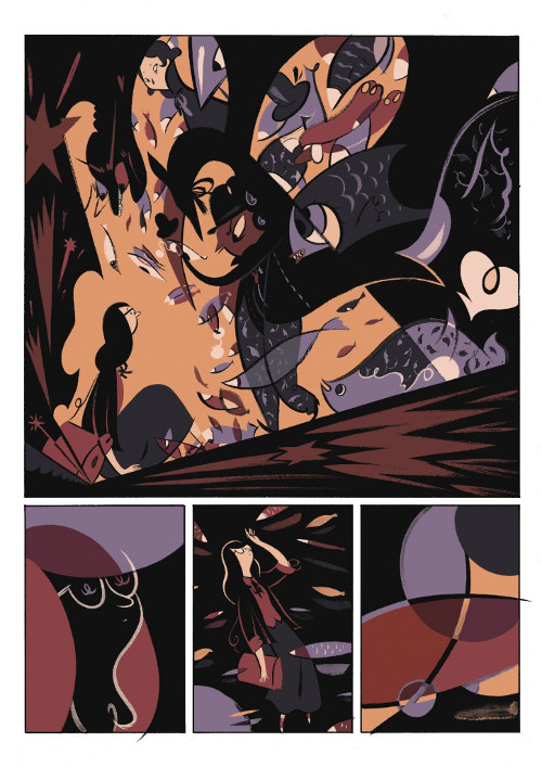
Where Bagnarelli is, at least for me, a completely new talent, Roman Muradov is an illustrator I’ve been watching for some time. For years Muradov has been one of the most interesting illustrative stylists working, with cover work and spot illustrations for The New Yorker, Penguin, The Wall Street Journal, The New York Times—pretty much any big publisher you can think of. And for good reason—Muradov’s work is idiosyncratically graceful, drawing from and complicating the design and animation style of fifties cartoons. Muradov’s illustrations are blissfully nostalgic, employing bold shapes in unique, colorful ways, and then twisting them toward the surreal.
So, it’s no big surprise that this first stab at a full-length book nods to Kafka on its opening page, dipping Muradov’s gorgeous illustrations into a moodily colored search for protagonist F. Premise’s missing innocence. Moving from the family dinner table, with her bug-like monster for a father, to the shop of a kind but cynical bookkeeper, to a strange and shifting underworld—Muradov’s Premise treks through a whimsically bizarre world worthy of any Lewis Carroll lover. And, as with the aforementioned Kafka and Carroll, Muradov’s narrative sensibilities often steer gleefully into befuddlement and perplexity, with coyly tangled wordplay and panels that are often opaquely dim. For what is a rather brief book, it’s this type of density and circular logic that really satisfies, making rereadings a necessary but welcome requirement (and interpretation an ethereal and potentially fraught exercise).
In the end, reading (In a Sense) Lost & Found seems to be of experiential importance—an act in soaking in weird beauty and coming out the other end sensibly revived toward the beautifully weird. Marked by its gilded binding, (In a Sense) Lost & Found is elegant, jazz-inspired, and hyper-literate, fitting Muradov as a comics up-and-comer destined to be mentioned alongside Tom Gauld, Seth, and Jason. In other words, among my favorite comics writers and artists. It’s an exciting first step.
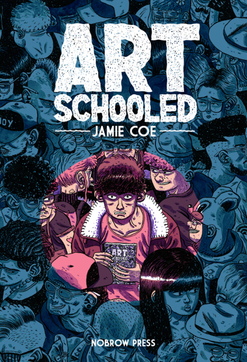
Art Schooled, by Jamie Coe. Nobrow Press, November 2014. 96 pages. $22.95, hardcover.
First things first: yes, the specter of Daniel Clowes’ four-page comic, “Art School Confidential” (more famous because of its film adaptation) looms heavily over Jamie Coe’s debut, Art Schooled. Fortunately, Coe seems undaunted, or at least smart enough to pick up where Clowes left off, pushing his own treatment of art school in a unique direction.
Art Schooled gives us Daniel Stope as its protagonist, a naïve small-towner who struggles transitioning into university life away from home, quickly becoming disenchanted with the pretentions of art school. As Clowes did before him, Coe makes a point of profiling the various stereotypes within Stope’s program—“the retro punk,” “the hip-hop stoner,” “the earthy-hippie,” etc. etc.—however, with Coe, these stereotypes become more bitingly detailed and, in the end, refreshingly nuanced. Having them play out over a book’s length, the bizarre characters Stope encounters are given an opportunity to expand beyond the confines of their degree, popping up in segments that occur after graduation. It’s a smart and paradoxical portrait as our classic stereotypes are both flattened and deepened simultaneously, which gives Art Schooled a lived-in quality that I’m sure many will interpret as autobiographical on Coe’s part.
Art-wise, Coe has an interesting style that combines rugged-yet-controlled line work with a highly saturated use of color. Perhaps one of my favorite things about Art Schooled is the range of formal techniques Coe employs. Told in a diary-like series of segments, Coe allows form and content to intertwine as the experimentation of art school is played out in the typography, layout, and color of each section. It’s a nice touch that both reflects the atmosphere of the book while keeping formally interesting.
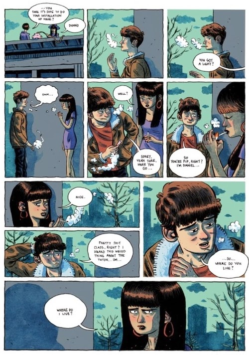
You might be asking, “So, what else is happening? What are the unique aspects of the narrative?” Well, I don’t know, should I be mentioning ceramic breasts as accidental bombs and the tact in punching someone in the neck? It’s definitely a worthy take on the subject. So, yes, we’re in art school again, but for those familiar (perhaps even more so for those who aren’t), Coe reveals the weird world of the arts in academia as a deep, potentially bottomless well. And for Coe, Art Schooled is, along with Bagnarelli and Muradov, another promising Nobrow debut.
Nick Francis Potter is a multimedia artist and writer from Salt Lake City, Utah. His website is nickfrancispotter.tumblr.com.
Check out HFR’s book catalog, publicity list, submission manager, and buy merch from our Spring store. Follow us on Instagram, Bluesky, and YouTube. Disclosure: HFR is an affiliate of Bookshop.org and we will earn a commission if you click through and make a purchase. Sales from Bookshop.org help support independent bookstores and small presses.
